Reading the Overview
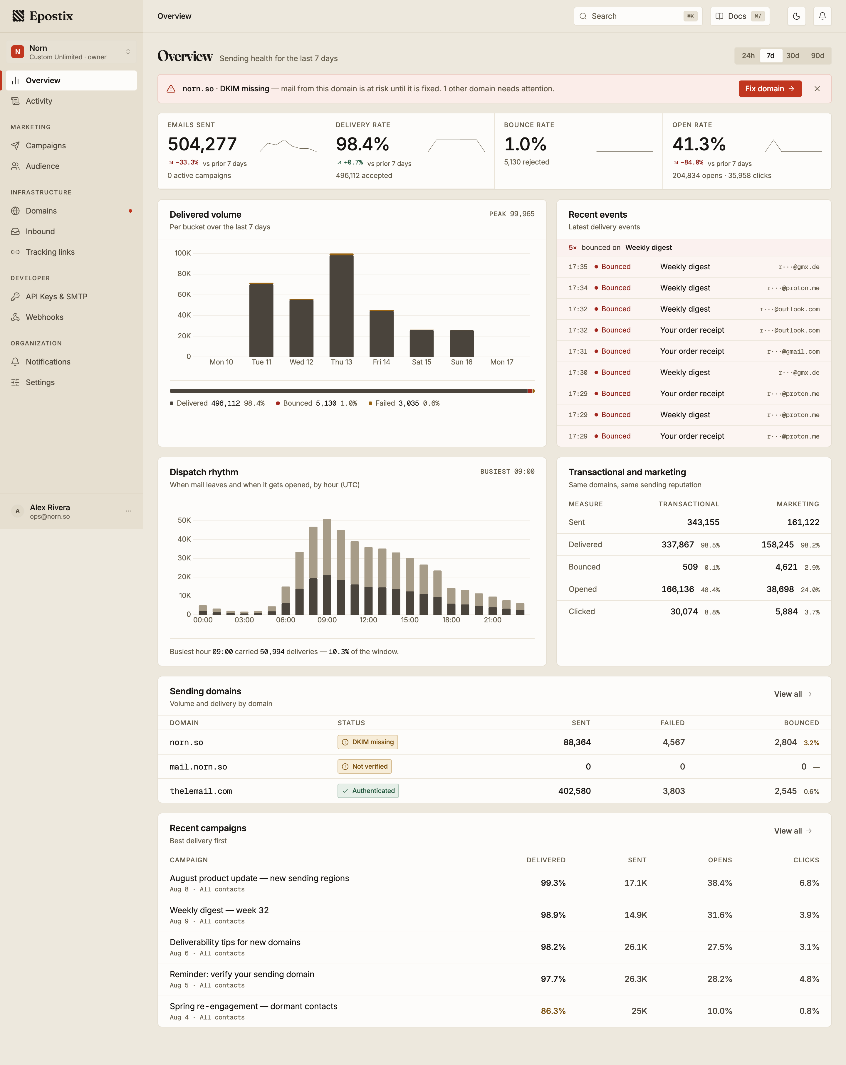
Overview answers one question: is mail leaving and arriving the way you expect it to? It is a reporting screen. Nothing on it changes your configuration. Every control either narrows the window or takes you to the screen where the change is made.
The reporting window
The control in the page header sets the window for the whole screen. Four windows are available: 24h, 7d, 30d and 90d. The default is 7 days.
The window is relative to the moment the page loads, not to a calendar boundary: 7d means the last 168 hours, not the last seven calendar days. Windows are measured in UTC, so a report reads the same wherever you open it.
The window is part of the page address, so it survives a reload and can be sent to someone else as a link. Press 1 to 4 to move between the four windows.
Every panel obeys the window except Recent events, which always streams the latest events regardless of what is selected.
The four measures

| Measure | What it counts |
|---|---|
| Emails sent | Messages accepted for sending in the window |
| Delivery rate | Delivered ÷ sent |
| Bounce rate | Bounces ÷ sent |
| Open rate | Opens ÷ delivered |
Open rate is measured against delivered mail, not against everything you sent. A message that never arrived cannot be opened, so counting it in the denominator would penalise you twice for the same failure. Expect this number to read higher than a tool that divides by sent.
Each measure carries a comparison against the window immediately before it. Looking at 7 days compares against the previous 7 days. Green means the change is in the good direction, which for bounce rate means downwards. A measure that has not moved shows no comparison at all.
Changes larger than a doubling are written as a multiple rather than a percentage:
×2.4 rather than +140%. Past a doubling, percentages stop being easy to read.
The line beside each figure traces that same measure across the window. It shows shape only. There is no scale on it, and two lines cannot be compared to each other.
Domains that need attention

When a sending domain is in a state that puts delivery at risk, it is named in a band at the top of the screen. Only the most urgent domain is named; if others are also affected, they are counted after it. Fix domain goes to that domain, which is where the problem can actually be resolved.
A domain is assigned exactly one state, in this order:
| State | Condition |
|---|---|
| Bouncing heavily | Bounce rate is 5% or higher |
| Not verified | The domain has not been verified |
| SPF / DKIM / DMARC missing | That record is not verified (checked in that order) |
| Verifying DNS | Verification is in progress |
| Bounce rate high | Bounce rate is 2% or higher |
| Authenticated | None of the above |
The first three raise the band. The rest are reported in the domains table but do not interrupt you.
Dismissing the band hides it until the next page load. It is not an acknowledgement, and it does not change the domain.
When every domain is authenticated and none is bouncing above the threshold, the band is replaced by a single line confirming it. No line and no band means no domains exist yet.
Delivered volume
Volume across the window, each bar stacked into delivered, bounced and failed. A bar covers one hour in the 24h window and one day in the others. Peak in the panel header is the busiest bar.
The three outcomes never overlap. A bounce is a rejection by the receiving mail server; a failure is anything else that stopped the message. A bounced message is not counted again as a failure, so the three add up to everything you sent.
Beneath the chart the same three outcomes are given for the whole window, as counts and as a share of everything sent. Those totals are the ones to quote; the chart is for finding the day something changed.
Dispatch rhythm
Deliveries by hour of day, in UTC, aggregated across the whole window rather than laid out in sequence. Twenty-four bars, each split into mail that was opened and mail that was delivered but not opened.
This is a shape, not a timeline. It answers when your recipients are reached and when they engage, which is what you need before moving a send time.
The busiest hour is called out with the share of the window's deliveries it carried.
Transactional and marketing
The same measures split by purpose. Product email and campaigns are separated here because they behave differently. They are sent from the same domains and share one sending reputation, which is why a campaign with a bad list degrades password resets.
Sending domains
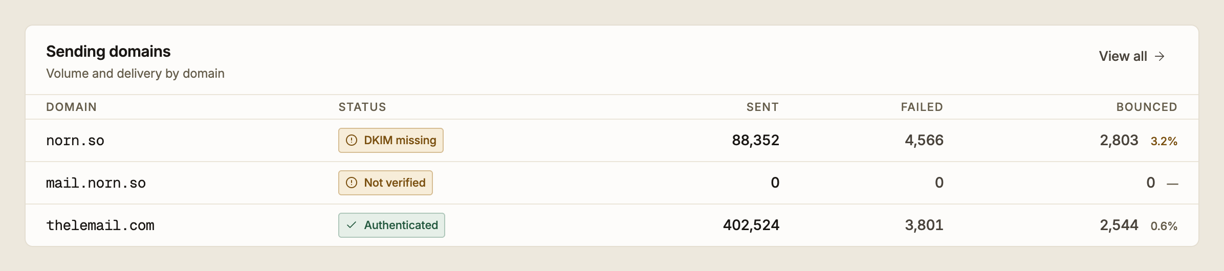
Every sending domain with its state and its traffic for the window. Rows are ordered by urgency first and volume second, so the domain that needs work is at the top even when it carries little mail.
Failed and Bounced count different things and do not overlap. The percentage beside the bounce count is that domain's bounce rate; it turns amber at 2% and red at 5%, the same thresholds that drive the state column.
A domain with no traffic in the window shows zeroes and no bounce rate. That is expected for a domain you have added but not yet sent from.
Recent events
Individual delivery events as they happen: sends, opens, clicks and failures. Each row carries the time in UTC, the subject and the masked recipient.
The list pauses while your pointer or keyboard focus is inside it, so a row cannot move out from under you as you read it. It resumes when you leave.
When the same event repeats on the same subject three or more times in a row, a summary line appears above the list. A run of failures on one subject is usually a single cause, not several.
This panel is not bound to the reporting window, and it is not a log. Use the Activity screen for search, filtering and history.
If the panel header reads Reconnecting… or Not connected, the feed has stopped updating and you are looking at old events. Reload to restore it. Nothing else on the page is affected, and no mail is affected. Only this panel.